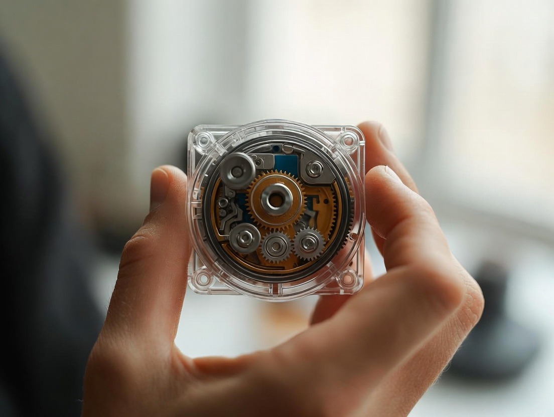
The Simplified Fitness Tracking Dashboard on Your Smart Ring
Presents a simplified, easy-to-understand dashboard for your fitness data.
Presents a simplified, easy-to-understand dashboard for your fitness data.
For years, the promise of quantified self—the idea that data could unlock our peak physical and mental potential—felt like a part-time job. We strapped on bulky watches, synced endless apps, and stared at dashboards so cluttered with graphs, charts, and metrics that they sparked more anxiety than action. The data was there, but the clarity wasn't. We were drowning in information but thirsty for insight. Then, a quiet revolution began, not on our wrists, but on our fingers.
Enter the modern smart ring and its most transformative feature: the simplified fitness tracking dashboard. This isn't just a smaller screen; it's a fundamental rethinking of what wellness technology should be. It's the move from complex data aggregation to intuitive, actionable guidance. By distilling the chaos of biometrics into a calm, coherent, and instantly understandable interface, the smart ring dashboard does something remarkable: it turns data into daily wisdom.
The genius lies in its constraints. Freed from the real estate of a phone screen or watch face, designers were forced to prioritize. What are the essential metrics? How can we present them in a way that feels less like a lab report and more like a personal coach? The result is a focused experience that aligns perfectly with how we actually live: on the move, short on time, and in need of answers, not more questions.
This article is your deep dive into the heart of this revolution. We’ll explore how the simplified dashboard on devices like the Oxyzen smart ring cuts through the noise, fosters true habit formation, and finally makes advanced health tracking something you don’t just use, but truly integrate into your life. This is where technology fades into the background, and your well-being comes into perfect focus.
We’ve all been there. You finish a workout, full of endorphins and a sense of accomplishment, only to open your fitness app and be greeted by a overwhelming tapestry of data. Heart rate zones plotted against elevation gain. A spaghetti graph of your GPS route. Calorie burn estimates next to VO2 Max predictions, flanked by recovery scores and sleep debt calculations from three nights ago. It’s a parade of numbers that demands analysis, comparison, and context. Instead of feeling empowered, you feel… assessed. And perhaps a little confused. Is a 48 ml/kg/min VO2 Max good for my age? Why did my heart rate variability dip this morning? Should I be concerned?
This phenomenon—data overload leading to decision paralysis—is the central failure of the first generation of fitness tech. The dashboard, intended to be a command center, became a source of cognitive friction. The problem isn't a lack of data; it's a lack of curation and narrative. When every metric is given equal visual weight, the truly important signals get lost in the noise.
Psychologically, this complexity creates several detrimental effects. First, it erodes motivation. For the average person seeking to improve their health, being confronted with a dozen poorly understood metrics after a simple walk can feel intimidating and demoralizing. The gap between "I moved my body" and "my anaerobic contribution was 12%" is vast and unnecessary. Second, it promotes obsessive or anxious behaviors. For some, the endless stream of data becomes a source of fixation, where a slight dip in a score can trigger undue stress, a condition sometimes dubbed "orthosomnia"—the unhealthy pursuit of perfect sleep data. You can read more about the honest pros and cons of this data-driven approach in our analysis Is Sleep Tracking Worth It? Honest Pros and Cons for 2025.
The complexity also fails on a practical, human level. Life is messy and linear. We don’t experience our health in separate, neatly tabulated buckets labeled "Sleep," "Activity," and "Nutrition." They are a continuous, interconnected loop. A poor night’s sleep affects afternoon workout performance, which influences stress levels, which then impacts the quality of the next night’s sleep. A dashboard that silos these metrics into distinct, non-communicating modules misses the entire story. It shows you the chapters, but not the plot.
This is the tyranny of choice applied to our own biology. When presented with too many options—or too many data points—we are more likely to disengage entirely. The smart ring’s simplified dashboard emerges as the antidote. By necessity and design, it asks: What is the minimum effective dose of insight required to inspire a positive behavior change? The answer is not a single number, but a carefully curated, context-aware presentation that prioritizes understanding over exhaustive detail. It’s the shift from being a data warehouse to being a personal interpreter.
The creation of an effective simplified dashboard is not an act of reduction by subtraction, but rather, reduction by distillation. It's a philosophical stance on what wellness technology should achieve: enlightenment, not enumeration. This philosophy is built on several core design principles that transform the smart ring interface from a mere display into a guide.
1. The Principle of Essential Information: This is the ruthless prioritization of metrics that are both highly actionable and universally meaningful. Instead of twenty data points, the focus narrows to a vital few: Readiness, Activity, and Sleep. Each of these becomes a composite score or a clear visual status, built from underlying complex biometrics (like heart rate variability, resting heart rate, body temperature, and movement), but presented as a simple, intuitive concept. The dashboard answers the only three questions that truly matter when you start your day: Am I recovered? What should I do? How can I prepare for tomorrow?
2. The Principle of Glanceability: Information must be comprehensible in under three seconds. This is the "smart ring advantage." A flick of the wrist to glance at your finger should give you an immediate status update, not require a 30-second study session. This is achieved through clean iconography, color coding (e.g., green for "go," amber for "caution," red for "rest"), and progress rings that show completion at a look. The goal is to make checking your status as effortless as checking the time.
3. The Principle of Progressive Disclosure: The simplified dashboard is the serene surface of a deep lake. The top-level scores are calm and clear. But for the user who wants to dive deeper, the layers are there. A tap on your "Sleep Score" can reveal the breakdown: duration, depth, restfulness, and timing. A tap on "Readiness" can show the contributing factors—how last night's deep sleep, yesterday's workout strain, and your body temperature trend influenced your score. This design respects both the casual user and the data enthusiast, without overwhelming the former.
4. The Principle of Positive Framing: Language and visualization are everything. Instead of a chart labeled "Heart Rate Variability (ms)" with a scary dip, the dashboard might show "Nervous System Calm: High" with a peaceful icon. It focuses on the state (calm, recovered, energized) rather than the raw, clinical metric. This human-centric language bridges the gap between data and lived experience, making the feedback feel like supportive coaching rather than a cold diagnosis.
5. The Principle of Holistic Connection: A truly intelligent dashboard doesn't show data in isolation. It weaves a narrative. It might note: "Your high readiness score is boosted by excellent deep sleep recovery last night. Ideal day for a challenging workout." Or conversely, "Lower readiness today. Consider a light activity like walking. Your body is prioritizing recovery." This is where the magic happens—when the dashboard stops reporting on the past and starts guiding the present. To understand how these recovery-focused metrics are built, explore our explainer on How Sleep Trackers Actually Work: The Technology Explained.
This philosophical framework is what makes platforms like the Oxyzen smart ring's companion app so effective. It’s a thoughtful curation of biometric science designed not to bombard you, but to enlighten you. It’s the embodiment of the famous design adage: "Perfection is achieved not when there is nothing more to add, but when there is nothing left to take away." The simplified dashboard removes everything except what is essential for your journey.
Imagine starting your day not with a frantic scroll through emails, but with a single, powerful number that tells you how prepared your body is to meet the demands ahead. This is the promise of the Daily Readiness Score—the cornerstone of the simplified smart ring dashboard. It’s your personalized, biometric morning briefing, condensing hours of physiological activity during sleep into one actionable insight.
But what goes into this score? It's not a guess; it's a sophisticated synthesis of key recovery metrics:
The dashboard’s genius is that you don’t need to analyze each of these datapoints. The algorithm does it for you, presenting a simple score (often out of 100) or a status like "Peak," "Ready," "Recover," or "Rest." This immediate feedback answers the critical question: Should I push hard today, or should I prioritize recovery?
The real-world application is transformative. A "Peak" score of 85+ is your green light. It’s the day to schedule that intense interval training, tackle the big presentation, or go on that long hike. Your body is telling you it’s primed for performance. A "Recover" score of 65, however, offers a different, equally valuable message. It suggests taking a restorative yoga class, a brisk walk, or focusing on hydration and stress management. Ignoring this guidance and pushing hard on a low-score day can dig you into a deeper recovery hole, increasing injury risk and burnout.
This daily check-in fosters a profound listening relationship with your body. Over time, you begin to see patterns. You’ll notice how a late alcohol consumption affects your next morning’s score. You’ll see the tangible recovery payoff of a consistent bedtime. The readiness score moves you from imposing a workout schedule on your body to collaborating with it. It’s the end of the "no pain, no gain" brute-force approach and the beginning of intelligent, adaptive training. This philosophy of listening to your body’s signals for optimal performance is central to our mission at Oxyzen, which you can read more about here.
For decades, the pedometer—and its digital descendant, the step counter—reigned supreme. "10,000 steps" became a global mantra. But the simplified dashboard challenges this one-size-fits-all dogma. It asks a better question: Was your movement truly meaningful for your body and goals today? This shift reframes activity from a simple quantity game to a qualitative assessment of exertion and impact.
The modern smart ring dashboard de-emphasizes the raw step count (though it’s often available in a deeper layer) and brings forward two more insightful concepts: Activity Score (or Exertion) and Recovery Time.
The Activity Score is a personalized measure of your daily movement burden. It doesn't just count steps; it analyzes heart rate data, movement intensity, and duration to estimate the physiological cost of your day. A slow, 90-minute walk and a 30-minute high-intensity spin class may both net you 5,000 steps, but their impact on your body—and their contribution to your Activity Score—will be vastly different. The dashboard intelligently credits you more for the sustained, elevated effort that drives adaptation. This encourages users to seek out varied intensity, moving beyond the sometimes-obsessive focus on a single, arbitrary step number.
Recovery Time Estimation is the logical, crucial companion to the Activity Score. After a workout, instead of just showing you calories burned, a sophisticated dashboard will provide an estimate of how long your body likely needs to return to its baseline—often broken down into muscular recovery and full metabolic recovery. This turns a post-workout glance into a planning tool. Seeing "Estimated Recovery: 48 hours" after a heavy leg day wisely discourages you from scheduling another intense lower-body session tomorrow, guiding you towards cross-training, mobility work, or rest instead.
Furthermore, the simplified dashboard excels at automatic activity recognition. While you focus on your gardening, morning jog, or weekend cycling trip, the ring’s sensors and algorithms work in the background to identify the activity type, record its duration, and estimate its intensity. Later, when you open the app, you’ll find these activities neatly logged without you ever pressing a "start" button. This passive tracking removes a major point of friction—remembering to manually track—and creates a more complete, effortless picture of your daily energy expenditure.
This reimagined approach to activity tracking fosters a healthier, more sustainable relationship with exercise. It rewards consistency and quality over sporadic, all-out efforts. It teaches the critical importance of recovery as part of the fitness equation, not just the absence of work. And by making the data about impact rather than just output, it helps you understand the true value of different movement modalities in your life. For athletes looking to fine-tune this balance, our article on Deep Sleep Optimization for Athletes: Recovery While You Rest offers targeted strategies.

If the readiness score is the headline, the sleep dashboard is the in-depth feature article on your previous night. But unlike the dense, technical reports of old, the simplified sleep dashboard is a masterclass in narrative clarity. It takes the incredibly complex symphony of brainwaves, heart rhythms, and bodily shifts that occur overnight and translates them into a coherent, visual story you can understand in moments.
At the top sits your overall Sleep Score—a quick, digestible verdict on the night. But the beauty is in the breakdown, typically presented as a clean, color-coded hypnogram bar chart alongside a few key metrics:
The dashboard uses this data to provide personalized insights, not just reports. It might point out: "You had 25% more deep sleep than your average. Great job on your 9:30 PM wind-down!" or "Notice more restlessness after your late dinner. Try finishing meals 3 hours before bed." These insights are the bridge between data and behavior change. They move from "what happened" to "why it might have happened and what you can do about it."
Perhaps most importantly, the simplified sleep dashboard helps users identify their patterns over time. A weekly or monthly view can reveal powerful trends: do your deep sleep percentages dip on work nights? Does your restfulness improve on days you exercise before 7 PM? This longitudinal view is where true sleep wisdom is born. You stop chasing a single "perfect" night and start cultivating a lifestyle that supports consistently good sleep.
This accessible approach demystifies sleep science. It helps users appreciate the non-negotiable importance of deep sleep for memory consolidation and physical repair, and the creative, emotional processing role of REM sleep. By making this knowledge visual and actionable, the smart ring dashboard empowers people to become active participants in their sleep health, rather than passive victims of a bad night. For those struggling to get enough of the most restorative stage, our compilation of 7 Proven Strategies to Get More Deep Sleep Tonight is a perfect place to start.
Beyond sleep and activity, our bodies are constantly communicating through a silent language of physiological signals that indicate our stress and recovery status. Traditional fitness trackers often ignored this subtle realm or buried it in advanced menus. The simplified dashboard brings it to the forefront, recognizing that managing stress is not a luxury, but a foundational pillar of holistic health. Two metrics are pivotal in this conversation: Heart Rate Variability (HRV) and Resting Heart Rate (RHR).
On the dashboard, you won't find these presented as raw, fluctuating numbers on a complex graph. Instead, they are translated into intuitive concepts. HRV, which measures the fine variations in time between each heartbeat, becomes an indicator of your "Nervous System Balance" or "Body Battery" trend. A higher, stable trend line suggests a resilient, recovered state where your "rest and digest" (parasympathetic) system is dominant. A significant dip or downward trend is a clear, objective flag from your body that it is under strain—be it from physical overtraining, emotional stress, poor sleep, or an oncoming illness.
Similarly, Resting Heart Rate is often shown relative to your personal baseline. A consistent, low RHR is a hallmark of cardiovascular fitness and good recovery. A spike in your morning RHR, clearly highlighted by the dashboard, is one of the earliest and most reliable signs that your body is fighting something or hasn't fully recovered.
The power of the simplified interface is how it correlates these metrics with your life. The dashboard might surface an insight like: "Your stress balance was lower on Tuesday afternoon. Note that this followed back-to-back meetings." Or "Your nighttime recovery was exceptionally high after your meditation session." These connections are transformative. They move stress from a subjective, fuzzy feeling ("I feel wired and tired") to an objective, measurable state with identifiable triggers and mitigators.
This creates a powerful feedback loop. By seeing the direct, physiological impact of a stressful event or a calming practice, you are incentivized to make smarter choices. You might start to prioritize a 10-minute breathing exercise after a hard workday because you've seen how it improves your HRV trend. You might choose to decline an optional late-night social event because you value the predictable drop in RHR that a consistent bedtime affords you. The dashboard becomes a biofeedback tool, teaching you what true recovery feels like in your own body and empowering you to cultivate more of it. For a deeper understanding of the silent signs your body gives, explore our article on the Silent Signs of Deep Sleep Deprivation.
A static dashboard is a limited one. The human body is not a machine with fixed thresholds; it's a dynamic, adaptive system with rhythms that change with age, fitness, lifestyle, and season. The most advanced simplified dashboards understand this. They are not just displaying data; they are learning algorithms that personalize every insight to you.
This process begins with the establishment of a personal baseline. During the first weeks of use, the ring quietly observes your unique patterns. What is your normal HRV range? What is your typical deep sleep percentage? What does a high-activity day look like for your current fitness level? There are no universal "good" or "bad" numbers, only what is normal for the individual. By building this personalized model, the dashboard ensures that its feedback is relevant. A readiness score of 72 might be "Good" for one person and "Below Average" for another, based entirely on their own historical data.
This learning continues over the long term. The dashboard adapts as you do. As you get fitter, your RHR may drop and your HRV may rise. The algorithms recognize these gradual shifts and adjust your baselines accordingly, so you're always being measured against your own potential, not a generic ideal. It also learns your weekly rhythms—perhaps your readiness is consistently lower on Mondays after a more active weekend, or your sleep is deeper on nights you don't use screens after 10 PM.
This adaptive intelligence culminates in predictive and prescriptive insights. Instead of just reporting that you slept poorly, a learning dashboard might note, "Based on your elevated temperature trend and lower HRV, your body is showing early signs of stress. Prioritizing 8 hours in bed tonight is recommended." Or after a period of consistent training and recovery, it might congratulate you: "Your recovery metrics have improved 15% over the last month, indicating positive fitness adaptation."
This personalization is what separates a smart device from a truly intelligent companion. It means the guidance you receive becomes more accurate and valuable over time. It turns the dashboard into a reflection of your unique biological journey, celebrating your personal progress and offering support tailored to your specific needs. This commitment to personalized, evolving insight is at the core of the Oxyzen experience, a principle rooted in our story and vision.
Integration & The Big Picture: Connecting the Dots for Holistic Health
The ultimate test of a wellness dashboard is not how well it displays isolated metrics, but how effectively it synthesizes them to tell the complete story of your well-being. A simplified dashboard excels here by force of focus. With only the core elements of Readiness, Activity, and Sleep in constant view, their interdependence becomes glaringly obvious. This visual and conceptual integration is the key to holistic understanding.
The dashboard actively encourages you to connect the dots. It’s designed to make the correlations visible:
This integrated view fights the compartmentalization of health. You can no longer ignore sleep because you're focused on "fitness," or neglect recovery because you're chasing an activity goal. The dashboard presents them as three legs of a stool—remove one, and the whole structure becomes unstable.
Furthermore, the best dashboards allow for manual logging of lifestyle factors (like caffeine intake, alcohol, medication, or subjective mood) alongside this biometric data. When you can log "two glasses of wine" and see its clear impact on your next night's sleep depth and next morning's resting heart rate on the same timeline, the cause-and-effect relationship becomes undeniable. This turns the dashboard into a personal science lab, where you can experiment and learn what truly optimizes your system.
This holistic, integrated perspective is the culmination of the simplified dashboard's philosophy. It provides not a collection of data points, but a coherent wellness narrative. It answers the most important question: "How is my whole body doing, and what does it need today to move me towards my long-term goals?" For those seeking to explore this interconnected approach to wellness further, a wealth of resources awaits on the Oxyzen blog.
The smart ring itself, with its elegant, screen-less design, is the perfect passive data collector. But the true home of the simplified dashboard is its companion smartphone app. This is where the distilled insights live, breathe, and become interactive. The app experience is carefully crafted to be an extension of the ring’s minimalist philosophy—a serene, focused space for reflection and planning, not another digital battleground for your attention.
Upon opening, you’re greeted by a clean, at-a-glance overview. Your readiness, last night's sleep, and today's activity progress are immediately visible, often with a single, salient piece of insight or guidance for the day. The color palette is calm, the typography is clear, and there is a deliberate use of white space. This intentional design reduces cognitive load, making your wellness check-in a moment of clarity rather than another scroll.
Navigation is intuitive and shallow. Tapping on any score takes you one level deeper into a beautifully visualized breakdown. The sleep detail page, for instance, might show your sleep stages as a landscape, with mountains of deep sleep and valleys of light sleep. The activity page might map your day's exertions on a timeline. But the design always maintains a "breadcrumb trail" back to the holistic overview, preventing you from getting lost in data weeds.
A critical feature of a best-in-class app is actionable notifications. The app doesn't buzz you incessantly. Instead, it sends timely, gentle nudges based on your data: "Your body temperature trend suggests you're entering your optimal sleep window in 60 minutes," or "You've been mostly sedentary for 90 minutes. A 5-minute walk could boost your focus." These are context-aware suggestions that feel supportive, not nagging.
Finally, the app serves as your long-term progress journal. Weekly and monthly review screens synthesize your trends, highlighting improvements ("Your average deep sleep increased by 12% this month!") and patterns ("Your lowest readiness scores consistently follow late dinners"). This macro view is essential for staying motivated and understanding the long-term impact of lifestyle changes. It transforms a daily tracker into a longitudinal health record that you own and control.
The companion app is where the magic of the simplified dashboard is fully realized. It’s the bridge between the silent, continuous sensing of the ring and your conscious, empowered decision-making. It’s proof that the most powerful technology doesn't shout for attention; it whispers the right insight at the right time. To see how this seamless experience comes to life and explore the Oxyzen ecosystem for yourself, the journey begins at our main storefront.
The most profound communication often happens without a single spoken syllable. A glance, a gesture, a color—each can convey complex meaning instantly. This principle of intuitive, non-verbal communication is the secret engine of the simplified smart ring dashboard. Having moved beyond the clutter of raw data, the dashboard's next task is to present curated insights in a way that our brains can process effortlessly, almost subconsciously. It employs a sophisticated visual language built on universal design principles to translate the abstract world of biometrics into concrete, actionable understanding.
This visual language is built on three core pillars: Color, Iconography, and Spatial Hierarchy. Used correctly, they create an interface that feels less like a tool and more like an extension of your own intuition.
Color as a Semantic Signal: The dashboard uses a restrained, purposeful color palette. Green is universally associated with "go," positivity, and optimal states. Amber or yellow signals "caution" or "attention needed." Red communicates "stop," "recovery," or a significant deviation. This traffic-light system is instinctively understood. You don't need to read a label to know that a green readiness ring means you're primed for the day, or a red segment in your sleep graph indicates restless tossing. Beyond status, color can encode data intensity—a gradient from light to dark blue might show the depth of your sleep stages, with deeper blues representing the most restorative deep sleep phase.
Iconography as Instant Recognition: Words take time to read; symbols are understood in milliseconds. A small, stylized moon icon next to a number instantly signifies "sleep duration." A heart with a tiny EKG line implies "heart rate variability." A flame suggests "activity" or "calories." A trending arrow up or down conveys progress or decline at a glance. This library of icons becomes a shorthand, allowing the dashboard to pack meaning into a very small space—perfect for the limited real estate of a mobile app and crucial for the ring's own potential for micro-interactions via a tiny LED or haptic pattern.
Spatial Hierarchy as a Guide: Where elements are placed tells you what's important. The largest, central element on your morning dashboard is almost always your Readiness Score. This isn't an accident; it's a design directive telling you, "This is the most important piece of information for you right now." Secondary metrics like sleep duration and activity progress occupy smaller, supporting positions. This hierarchy trains your eye to find what matters most, streamlining your daily check-in to seconds.
This visual synthesis creates what designers call pre-attentive processing—the brain's ability to absorb information before conscious thought kicks in. You "get it" before you even try to. This reduces the mental energy required for health monitoring, transforming it from a chore into a seamless, almost gratifying habit. It’s the difference between reading a technical manual and understanding a well-designed road sign. For a deeper look at the technology that makes this sophisticated data collection possible, our article on Sleep Tracking Accuracy: What Your Device Can and Can't Measure provides valuable context.

Daily insights are powerful, but they can be myopic. A single low sleep score or a high-stress day is just a data point. True wisdom—and lasting behavior change—comes from observing patterns over time. The simplified dashboard’s weekly and monthly review features are where this longitudinal intelligence comes to life, transforming sporadic observations into a coherent narrative of your life’s rhythm.
Moving from the "Today" view to the "Weekly" view is like stepping back from a single brushstroke to see the entire painting. Suddenly, connections emerge that were invisible at a daily granularity. The weekly dashboard typically presents key metrics—Sleep Score, Readiness Score, Activity Load—as smooth trend lines or bar charts across the seven-day canvas. This visual format makes it easy to spot:
The dashboard often summarizes these patterns with weekly insights. These are algorithmically generated takeaways that highlight the most significant trend. For example: "You showed strong recovery on days following an afternoon walk," or "Your deepest sleep this week correlated with nights you finished eating before 8 PM." These insights move beyond reporting to gentle coaching, helping you repeat what works and adjust what doesn’t.
This weekly rhythm analysis is particularly crucial for understanding cyclical biological processes, especially for women. Advanced platforms can integrate cycle tracking, showing how metrics like resting heart rate, basal body temperature, and sleep needs fluctuate predictably across phases. Seeing your readiness score naturally dip during the luteal phase, for instance, normalizes the experience and encourages you to honor your body's changing needs rather than fighting against them.
By revealing your personal weekly rhythm, the dashboard helps you plan with your biology, not against it. You can schedule challenging tasks for your predicted high-readiness days and plan for more recovery on predictable low-energy days. It fosters self-compassion by providing objective evidence that your energy and performance are not static, but part of a natural, intelligent cycle. Understanding these cycles is a part of holistic health, a topic we frequently explore with our community on the Oxyzen blog.
In a world saturated with metrics, the ability to distill complexity into a single, meaningful number is a superpower. This is the role of composite scores—like your overall Sleep Score, Readiness Score, and Activity Score—within the simplified dashboard. These are not averages; they are carefully weighted algorithms that synthesize multiple data streams into one unifying verdict. And this simplification is paradoxically the feature that makes the dashboard so powerfully actionable.
The psychological impact of a single score is profound. It provides clarity and reduces ambiguity. Faced with ten separate sleep metrics, you might hesitate, unsure which to prioritize. But a Sleep Score of 82/100 gives an immediate, unambiguous assessment: "You had a good night." This clarity eliminates paralysis and fuels decisive action. A low score prompts the question, "What can I do to improve this tonight?" while a high score reinforces positive habits.
These scores also create a universal language for self-assessment. You begin to develop an intuitive sense of what a "75" feels like in your body versus an "88." This internal calibration is far more useful than knowing your precise REM duration in minutes. It turns an abstract concept like "recovery" into a tangible, daily measure you can track and strive to improve.
Most importantly, a single score is highly motivational. It gamifies wellness in the best sense, providing a clear, daily target. The human brain is wired to seek completion and improvement. Seeing a progress ring around your Activity Score fill up to 100% triggers a small hit of dopamine, rewarding consistency. Watching your Sleep Score trend upward over a week or month provides a powerful sense of accomplishment that is more impactful than watching a dozen separate lines slowly change.
This doesn't mean the underlying data is hidden. The principle of progressive disclosure is key here. The single score is the invitation. Tapping on your "Readiness: 74" reveals the contributors: "Sleep: +25, HRV: +30, Activity Load: +15, Temperature: +4." This breakdown is invaluable for learning. If your score is low, you can instantly see the primary culprit—perhaps a poor HRV contribution dragging it down, pointing you towards stress management for the day.
The composite score model aligns perfectly with how we experience our own well-being. We don't wake up and say, "My heart rate variability is 42 ms, my resting heart rate is 58 bpm, and my sleep efficiency was 91%." We say, "I feel great today," or "I feel drained." The dashboard's scores are a data-driven proxy for that subjective feeling, creating a reliable, objective anchor for our often-imprecise self-perception. For beginners looking to understand the foundation of these scores, our Sleep Tracking 101 guide is an excellent starting point.
Collecting beautiful data is pointless if it doesn't change what you do. The final and most critical function of the simplified dashboard is to act as a behavior change catalyst. It achieves this not through forceful mandates or alarming alerts, but through the sophisticated application of nudge theory—a concept from behavioral economics that suggests positive reinforcement and indirect suggestions can influence decision-making more effectively than direct instruction.
The dashboard is a masterful "choice architect," designed to make the healthy choice the easy and obvious one. Here’s how it implements nudges:
1. Timely, Context-Aware Notifications: Instead of bombarding you, the app sends gentle, intelligent nudges at the right moment. As evening approaches, it might say, "Your body temperature is beginning to drop, signaling your natural sleep window is opening in 60 minutes." This isn't a command to go to bed; it's a helpful cue that aligns with your own physiology, making it easier to act. After a period of inactivity during a workday, a simple, non-judgmental reminder: "Time to move? A 5-minute walk can boost circulation and focus."
2. Framing and Goal Setting: The dashboard uses positive framing. Instead of "You failed to reach your sleep goal," it might show, "You achieved 7.2 hours of sleep last night. Reaching your 8-hour goal tonight will help boost your readiness." It focuses on attainable, proximal goals ("Close your activity ring today") rather than distant, vague ones ("Get fit"). This makes progress feel continuous and achievable.
3. Social Proof (When Appropriate): Some platforms offer optional, anonymized community benchmarks. Seeing that your sleep consistency is in the "top 20%" of your age group can be a motivating nudge. However, the best dashboards use this sparingly, knowing that comparison can backfire. The primary comparison is always you vs. your own baseline.
4. The Power of Defaults: The dashboard's very design establishes healthy defaults. By making "Readiness" the first thing you see, it defaults your attention to recovery. By presenting a sleep schedule, it suggests a default bedtime. These subtle architectural choices guide your focus without restricting your freedom.
5. Making Consequences Visible: This is the most powerful nudge of all. When you can log "two glasses of wine" and then see the direct, graphical impact on your subsequent sleep depth and next-day readiness, the cause-and-effect relationship is internalized. The dashboard provides immediate, personal feedback for your choices, creating a powerful learning loop that encourages better decisions in the future. You’re not following a rule; you’re responding to clear evidence from your own body.
By integrating these behavioral science principles, the dashboard moves from being a passive mirror to an active guide. It helps you build micro-habits—small, sustainable actions that compound over time. One nudge to wind down earlier, one suggestion to take a walking break, one insight connecting caffeine timing to sleep quality—these accumulate into profound lifestyle shifts. The dashboard’s role is to make those positive micro-choices a little easier, a little more obvious, every single day. For real-life examples of how these nudges translate into transformed routines, our customer testimonials share powerful stories.
In an age of digital bombardment, where every app vies for our attention with notifications, badges, and alerts, the smart ring and its dashboard offer a radical alternative: thoughtful silence. This intentional minimalism isn't just an aesthetic choice; it's a therapeutic one. It directly counters the "tech anxiety" and "notification fatigue" that plague modern life, positioning the device as a supportive partner rather than another demanding master.
The ring itself is the first layer of this calm design. Unlike a smartwatch, it has no screen lighting up with every email, message, or social media ping. It sits silently on your finger, gathering data without ever asking for your eyeballs. This alone creates a profound sense of peace. Your biometrics are monitored without the constant, intrusive presence of a glowing rectangle on your wrist.
This philosophy of calm extends fully to the companion app. The interface is decluttered, using ample white space and a restrained color palette to create a visual "breathing room." Information is presented calmly and sparingly. There are no flashing banners, no red notification badges screaming for attention (unless for a truly critical, user-set alert). The check-in is user-initiated. You open the app when you are ready for reflection, not when it demands your attention.
This reduces the potential for obsessive checking, a common downside of fitness tech. When data is always visible on a wrist screen, it can trigger compulsive glances throughout the day—checking heart rate during a meeting, staring at step count while walking. The ring's passive nature and the app's calm design break this cycle. Engagement becomes a mindful, once-or-twice-a-day ritual of reflection and planning, not a minute-by-minute fixation.
Furthermore, the data presentation is engineered to reduce performance anxiety. By focusing on holistic scores and body states ("Recovered," "Balanced") rather than ever-fluctuating raw numbers, the dashboard avoids creating a sense that you are "failing" in real-time. A dip in your HRV is contextualized within your readiness narrative—it's information prompting self-care, not a judgment on your current worth.
This design approach respects your mental bandwidth. It understands that wellness technology should lower stress, not contribute to it. The smart ring dashboard becomes a haven of clarity in the noisy digital world—a tool that serves you on your terms, empowering you with insight while protecting your peace. This commitment to user-centric, non-intrusive design is a core part of our philosophy at Oxyzen.
A dashboard, no matter how beautifully simple, is only as valuable as the data that fuels it. For users to truly trust and act upon the insights—to heed a "Rest" day recommendation or believe a "Peak" readiness score—they must have unwavering confidence in the accuracy and reliability of the underlying measurements. Building this trust is a multi-layered challenge that the best smart ring platforms address with transparency and technological rigor.
The foundation is sensor fusion. A modern smart ring doesn't rely on a single sensor. It combines a suite of medical-grade components:
The dashboard’s role is to communicate this accuracy responsibly. It does this by:
Finally, trust is cemented through personalization over time. As the ring learns your unique baselines, its insights become more precise for you. The algorithm learns that your resting heart rate is naturally higher than average, or that your temperature shifts follow a specific pattern. This tailored understanding means the "low" or "high" flags are calibrated to your normal, making them profoundly more meaningful and trustworthy.
In essence, the dashboard earns your trust not by claiming infallibility, but by demonstrating consistent, sensible, and personalized insight that helps you make better decisions. It becomes a reliable reflection of your body, a trusted advisor you learn to rely on. For common questions on how this all works, our comprehensive FAQ provides clear answers.
Today's simplified dashboard excels at telling you what has happened and what your current state is. The next evolutionary leap—already beginning—is moving from descriptive and diagnostic analytics to predictive and prescriptive intelligence. The dashboard of the very near future will not just report on your sleep; it will predict your ideal bedtime tonight. It won't just tell you you're stressed; it will suggest the most effective de-stressing intervention for you, right now.
This future is powered by contextual awareness and longitudinal learning. By analyzing months or years of your personalized data across millions of anonymized data points from other users, advanced AI models can identify subtle, predictive patterns that are invisible to the human eye.
Imagine your dashboard offering insights like:
This shift requires immense respect for privacy and user agency. Predictive insights must be presented as optional guidance, not deterministic decrees. The human must always be in the loop, making the final call based on the dashboard's intelligent suggestions.
This future transforms the dashboard from a tracking tool into a true health partner. It leverages the ring's 24/7, unobtrusive data stream to provide a continuous, adaptive layer of intelligence around your life, helping you navigate not just fitness, but overall well-being with foresight and confidence. It's the culmination of the simplified dashboard's journey: from reducing noise, to providing clarity, to finally offering a glimpse of what comes next.
The potential of this technology is vast, but it begins with a single step: starting your own data story. For a new user, the simplified dashboard can still feel like a new language. The key to success is to begin not with obsession, but with observation. Here is a practical guide to building a meaningful wellness narrative with your smart ring.
Week 1-2: The Baseline Phase. During this period, your only job is to wear the ring consistently (especially at night) and live your normal life. Avoid the temptation to make drastic changes. Let the ring learn you—your typical sleep, your everyday stress, your normal activity patterns. Check the dashboard once a day, perhaps in the morning, simply to observe. Don't judge the numbers; just notice them. This establishes your personal "normal," the crucial baseline against which all future changes will be measured.
Week 3-4: The Connection Phase. Now, start to connect the dots. Begin using the manual logging feature for just one or two things you're curious about: evening caffeine, alcohol, a particularly stressful workday, or a new workout class. The next day, look at your dashboard. Can you see the impact? This phase is about playful experimentation and learning your body's unique responses. You might discover that a late dinner has a bigger impact on your sleep than a glass of wine, or that a morning workout leaves you energized, while an evening one disrupts your sleep.
Month 2 and Beyond: The Integration Phase. Now, you can start to use the insights gently. If you see a "Recover" readiness score, give yourself permission to swap the intense workout for a walk or yoga. If the dashboard suggests your sleep window is opening, use it as a cue to start your wind-down routine. The goal is not slavish obedience to the scores, but informed collaboration. Let the data be a trusted second opinion on how you feel.
Building Your Long-Term Narrative: Make a habit of reviewing your weekly insights every Sunday. This is where you see the story of your week. Celebrate the positive trends—"My average sleep score improved!"—and investigate the negative ones without self-criticism. Over months, this long-term view becomes your most powerful tool. It can show you the impact of a new job, a new exercise regimen, or a consistent meditation practice on your hard-wired biometrics.
Remember, the dashboard is a mirror, not a judge. Its purpose is to empower you with knowledge, not to create a new source of anxiety. The journey is about progress, not perfection. By starting with curiosity and building a habit of mindful observation, you'll unlock the true power of having a simplified fitness tracking dashboard right on your finger—and in your pocket. To begin this journey for yourself and discover the Oxyzen smart ring, your entry point is our featured online shop.
The true power of personal biometric data is not in its isolation, but in its connections. A smart ring’s simplified dashboard is a masterful command center for the data it collects directly, but its value multiplies exponentially when it becomes a connective hub within your broader digital health ecosystem. This integration is where the smart ring transitions from a standalone wellness gadget to a central piece of your holistic health infrastructure, creating a unified picture that doctors, trainers, and you yourself have never had before.
The modern health ecosystem is fragmented. Your primary care physician has your medical history. Your fitness app has your workout logs. Your nutrition tracker has your food diary. Your mental wellness app has your mood charts. These are all valuable islands of data, but they rarely communicate. The smart ring, with its 24/7 physiological dataset, is the perfect bridge between these domains.
Seamless App Integration (The API Layer): Advanced smart ring platforms offer open APIs or direct integrations with major health and fitness platforms like Apple Health, Google Fit, Strava, and TrainingPeaks. This is a bidirectional data superhighway. Your ring automatically pushes its core data—sleep stages, resting heart rate, HRV, and activity—into these centralized repositories. Conversely, it can pull in data from other sources. Imagine your dashboard displaying not just your readiness score, but annotating it with: “Note: Logged a high-intensity 10k run in Strava yesterday,” or “Mood log indicates elevated stress.” This creates a profoundly richer context. Your low readiness score isn’t a mystery; it’s clearly linked to yesterday’s hard effort and today’s work anxiety.
Informing Your Healthcare Conversations: This integrated data becomes powerful ammunition for proactive health discussions. Instead of vaguely telling your doctor, “I’ve been feeling more tired lately,” you can share a trend report showing a three-month decline in your average HRV, a gradual creep in your resting heart rate, and a pattern of sleep fragmentation. This objective, longitudinal data moves the conversation from subjective symptoms to observable patterns, helping to guide more precise questioning and investigation. It empowers you to be an engaged, data-informed participant in your own care.
The Fitness Synergy: For athletes and serious fitness enthusiasts, this integration is game-changing. Syncing with platforms like TrainingPeaks or Strava allows for Performance Management Chart overlays. Your fitness (chronic training load), fatigue (acute training load), and form (readiness) can be calculated not just from your logged workouts, but now also incorporate your body’s actual physiological response (HRV, sleep, RHR). This creates the most personalized and responsive training feedback loop possible. A coach can see not only that you completed a workout, but also how well you recovered from it, enabling truly adaptive periodization.
Creating a Unified Health Timeline: The ultimate promise is a single, scrollable timeline of your life’s health context. On a given day, this timeline could show: your sleep graph, your morning readiness score, your logged breakfast, your heart rate during a noon meeting, your afternoon workout from your cycling computer, your post-workout recovery metrics, your evening meditation session from a mindfulness app, and your final sleep preparation. This holistic view reveals the intricate cause-and-effect dance of lifestyle on biology in a way no single app ever could.
By serving as this connective hub, the smart ring dashboard fulfills a higher purpose: it breaks down the silos of our health data. It allows us to see the person—not just the patient, the athlete, or the sleeper—in their full, interconnected complexity. This is the foundation for a future of truly personalized and preventive health. For those interested in the technical journey and vision behind creating such an integrated system, the Oxyzen story details our approach.
For too long, the “fitness” in fitness tracking has been narrowly associated with physical exertion—heart rates, steps, and calories. But a new understanding is taking hold: physical recovery and mental well-being are two sides of the same coin. The simplified smart ring dashboard, with its focus on autonomic nervous system metrics like Heart Rate Variability (HRV) and resting heart rate, is uniquely positioned to become a groundbreaking tool for mental and emotional awareness, offering an objective window into our subjective states.
The link is direct and physiological. The autonomic nervous system (ANS) is our body’s control center for stress and relaxation. The sympathetic branch (“fight-or-flight”) accelerates heart rate and prepares for action. The parasympathetic branch (“rest-and-digest”) slows the heart, promotes digestion, and enables recovery. HRV is the single best non-invasive measure of ANS balance. A high, resilient HRV indicates a system that can flexibly respond to stress and then return to calm. A low or dropping HRV suggests a system stuck in a stressed, sympathetic-dominant state, or one that is simply depleted.
The dashboard translates this science into daily insight. You don’t need to understand ms or rMSSD units. Instead, you see a “Stress Balance” or “Recovery” metric that trends up or down. You might receive a gentle insight: “Your nervous system showed signs of elevated stress this afternoon. Consider a breathing exercise.” This feedback is transformative because it’s objective. You may think you’re handling a stressful day well, but a plummeting HRV trend tells the true story of your physiological burden. Conversely, after a meditation session, you might feel calmer, and now you have the data to prove its tangible, bodily impact with a rising recovery score.
This creates a powerful biofeedback loop for emotional regulation. Over time, users learn to associate certain feelings, thoughts, or situations with their physiological signatures. You begin to recognize what a “frustration dip” or an “anxiety spike” looks like on your chart. More importantly, you can experiment with interventions and immediately see their effect. Does a walk in nature calm your system more than scrolling social media? Does a particular breathing technique (like box breathing or 4-7-8) reliably boost your HRV? The dashboard provides real-time, personal evidence, empowering you to build a personalized toolkit for emotional resilience.
Furthermore, by correlating this data with sleep, the dashboard highlights the vicious cycle of stress and poor rest. A stressful day leads to higher sympathetic drive at night, reducing sleep quality (especially the crucial, restorative deep sleep). Poor sleep, in turn, lowers HRV and ANS resilience the next day, making you more vulnerable to stress. The dashboard can illuminate this cycle, prompting you to break it with targeted sleep hygiene or wind-down routines on high-stress days.
In this role, the smart ring ceases to be just a fitness device. It becomes a mind-body integrator. It teaches us that mental well-being is not a separate pursuit from physical health; it is physiological. By making the invisible visible, the dashboard fosters a deeper mind-body connection, self-compassion, and the practical skills to navigate modern life with greater calm and resilience. Exploring the resources on our blog can provide further strategies for nurturing this connection.
Sleep is the non-negotiable foundation of health, and the smart ring dashboard is its ultimate architect’s blueprint. Moving beyond simple duration tracking, the modern sleep dashboard provides a detailed, actionable report card that allows you to reverse-engineer a perfect night’s sleep. It shifts the paradigm from hoping for good sleep to systematically engineering it. Let’s explore how to use each element of the sleep dashboard as a lever for optimization.
1. The Chronometer: Sleep Timing & Consistency. Your dashboard shows not just when you fell asleep, but your bedtime relative to your personal circadian rhythm. A key insight is your "Sleep Consistency" score. The human body thrives on rhythm. Going to bed and waking up at roughly the same time every day (even on weekends) strengthens your circadian clock, leading to easier sleep onset, more predictable deep sleep cycles, and higher morning alertness. The dashboard makes your inconsistency glaringly obvious, providing the motivation to lock in a schedule. Tip: Use the app’s bedtime reminder feature to nudge you towards consistency.
2. The Quality Gauge: Sleep Stages & Restfulness. This is the core of the optimization deep dive. Your breakdown of Light, Deep, and REM sleep is your guide.
3. The Environmental Sensor: Temperature Trends. Advanced rings track your peripheral body temperature throughout the night. A smooth, predictable drop and rise is a sign of a robust circadian rhythm. A disrupted or elevated temperature trend can signal stress, illness, or a suboptimal sleep environment. Use this data to validate your bedroom temperature settings.
By treating your sleep dashboard as a weekly lab report, you can run experiments. For one week, implement a strict digital sunset at 10 PM. Next week, try adding a magnesium supplement or tart cherry juice. The next, focus on perfect room darkness and silence. Observe which intervention moves the needle on your Sleep Score and specific stage durations. This data-driven, iterative process is how you discover the exact recipe for your perfect sleep. For a comprehensive starting point, beginners can consult Sleep Tracking 101: Everything Beginners Need to Know.
Nutrition & Biomarkers: The Indirect Connections Your Dashboard Reveals
You are what you eat—and your smart ring’s biometric dashboard is a startlingly accurate mirror reflecting that truth. While no current consumer ring can directly measure glucose or specific nutrient levels, it is exquisitely sensitive to the systemic physiological effects of your dietary choices. By learning to read the indirect signals, you can use your dashboard as a powerful tool for nutritional insight and experimentation.
1. The Inflammation & Recovery Signal: A meal high in processed sugars, refined carbohydrates, or excessive saturated fats can trigger a low-grade inflammatory response in the body. This systemic inflammation is a stressor. How does it show up? Look for:
2. The Energy & Stability Signal: Meals that cause rapid blood sugar spikes and crashes create a rollercoaster of energy that stresses your system. Conversely, meals with balanced protein, fiber, and healthy fats promote metabolic stability. On your dashboard, this may manifest as:
3. The Hydration & Circulation Signal: Chronic mild dehydration thickens the blood, making the heart work harder. This can lead to a subtle but noticeable creep in your resting heart rate and a drop in HRV. Observing this trend can be a nudge to increase your water intake, especially if paired with other subjective feelings of fatigue.
How to Use This for Nutritional Experimentation:
Adopt a “test and observe” approach. For a baseline week, eat as you normally do and note your average morning RHR and HRV. Then, choose one variable to change for a 5-7 day “experiment.”
Logging is Key: Use the app’s note feature to log meals loosely (“Large pasta dinner,” “Salad with salmon lunch,” “Late-night pizza”). The correlation won’t be perfect, but over time, glaring patterns will emerge. You’ll gain an objective, biofeedback-driven understanding of how different foods truly make you feel and function, far beyond just taste or guilt. This is personalized nutrition at its most pragmatic. For insights into foods that specifically support restorative sleep, our list of 10 Foods That Increase Deep Sleep Naturally offers delicious options.

Our bodies are not static machines; they are dynamic organisms that change profoundly across a lifespan. A one-size-fits-all fitness dashboard fails to account for this. A truly intelligent system recognizes that the biological priorities, recovery needs, and optimal targets for a 25-year-old athlete, a 40-year-old parent, and a 65-year-old retiree are fundamentally different. The simplified smart ring dashboard, through personalized baselines and adaptive algorithms, begins to provide age-aware and life-stage-appropriate guidance.
The Changing Landscape of Sleep: The most dramatic age-related shifts are in sleep architecture. The dashboard visually chronicles this natural evolution.
Recovery & The Autonomic Nervous System: Heart Rate Variability (HRV) also has a general downward trend with age, reflecting the natural slowing of autonomic nervous system flexibility. A simplified dashboard doesn’t show you a “bad” HRV number compared to a younger person; it shows you your trend relative to your own baseline. A sustained drop from your normal is a meaningful alert, regardless of your age. This allows the dashboard to provide relevant recovery advice—a 55-year-old might be guided towards more emphasis on mobility, stress management, and sleep quality over intense, frequent training.
Life Stage Context: Beyond chronological age, life stages bring different stressors. The dashboard can help navigate:
By respecting and adapting to these biological realities, the dashboard transforms from a generic tracker into a lifelong wellness companion. It provides context that normalizes changes, offers targeted guidance for each chapter of life, and helps you invest in the specific health assets that matter most for your current age and stage. This compassionate, adaptive intelligence is what makes it a tool for sustainable healthspan, not just performance.
The wearable technology market offers choices, primarily between wrist-worn smartwatches/fitness trackers and finger-worn smart rings. Each has its strengths, but when it comes to the core mission of providing a simplified, insightful, and non-intrusive wellness dashboard, the smart ring holds distinct comparative advantages that align perfectly with a holistic, recovery-focused philosophy.
1. The Data Advantage: Unobtrusive, Medical-Grade Accuracy.
2. The Interface Advantage: Focused Serenity vs. Digital Noise.
3. The Psychological Advantage: Reducing Obsession and Anxiety.
The Smartwatch’s Strengths (And Where the Ring Complements): Smartwatches excel at real-time workout metrics (pace, distance, intricate heart zone training) and communications/notifications. They are superb for the active doing phase of fitness. The smart ring, conversely, is the master of the recovery and readiness phase. The ideal scenario for the serious wellness enthusiast is not an either/or choice, but a both/and synergy. Use the smartwatch for guided workouts and GPS runs, and let the smart ring handle 24/7 baseline monitoring, sleep tracking, and recovery management. The two devices can sync data via Apple Health/Google Fit, giving you the ultimate combined dashboard. To explore how Oxyzen’s ring-centric philosophy delivers on this focused promise, the journey starts at our main shop.
Initial motivation with a new health tool is easy. The novelty drives engagement, and early insights feel revolutionary. But what happens after six months or a year? When the initial excitement fades and progress inevitably plateaus, does the device become another drawer relic? The sophisticated simplified dashboard is designed specifically for this long game, evolving from a novelty into a trusted long-term coach that helps you navigate stagnation and sustain motivation.
1. Shifting the Goalpost: From Outcomes to Consistency. Early on, goals are outcome-based: “Lose 10 pounds,” “Run a 5k,” “Increase my Sleep Score to 90.” These are powerful starters. The dashboard’s role in the long term is to help you transition to process-based goals once outcomes are achieved or plateau. The focus becomes:
The dashboard celebrates these behavioral wins, which are fully within your control, keeping you engaged even when the scale or performance metrics stall.
2. Revealing Subtle Trends: The Macro View for Micro-Wins. When daily numbers feel static, zoom out. The monthly and yearly views on the dashboard are motivation goldmines. Here, you might see that your average resting heart rate has dropped by 3 BPM over the last year, a clear sign of improved cardiovascular fitness. You might see your deep sleep percentage has stabilized at a higher level than a year ago, indicating better sleep hygiene. These long-term, positive trends are easy to miss day-to-day but are profound indicators of healthspan improvement. The dashboard surfaces them, providing a deep sense of accomplishment.
3. Preventing Burnout and Injury: The Ultimate Motivation Protector. Nothing derails motivation faster than injury or burnout. The dashboard’s readiness and recovery metrics are your early-warning system. By encouraging you to take a rest day when your body needs it, it prevents the overtraining that leads to setbacks. Staying healthy and avoiding injury is the single most motivating factor for long-term adherence. The dashboard acts as a responsible coach, pulling you back to ensure you can train again tomorrow, and for thousands of tomorrows after that.
4. Embracing the Experimentation Mindset. When progress plateaus, the dashboard becomes your lab notebook. It’s time to run a new experiment. Change your workout timing. Try a new sleep supplement. Experiment with a different diet approach. Use the dashboard to meticulously track the inputs and measure the subtle output changes in recovery, sleep, and readiness. This turns a plateau into an exciting period of self-discovery, keeping the intellectual curiosity alive.
5. The Power of Reflection: A good dashboard includes a journal or note feature. Use it. Write a quick note on days you feel amazing or terrible. Over time, you can look back and correlate those feelings with the objective data. This builds a rich, personal narrative of your health journey that is more motivating than any single metric. You’re not just collecting data; you’re writing the story of your better health.
In essence, the long-term value of the dashboard is not in providing constant novelty, but in providing constant, reliable, and insightful companionship. It’s the coach that knows your history, respects your body’s signals, celebrates your consistency, and guides you safely through the inevitable ups and downs of a lifelong wellness journey. For inspiration from others on this long-term path, our testimonials page shares real user stories.
Data and theory are compelling, but the true test of any technology is its impact on real people in real situations. The power of the simplified smart ring dashboard is best understood not through its algorithms, but through the stories of transformation it enables. Here are anonymized vignettes that illustrate how this tool changes daily decisions and long-term health trajectories.
Story 1: The "Always Tired" Executive. Mark, 48, was successful but perpetually exhausted. He drank coffee all day, slept fitfully for 5-6 hours a night, and felt his stress was "just part of the job." His smart ring dashboard told a different story. His Sleep Score averaged 65, with high restlessness and minimal deep sleep. His readiness score was chronically in the "Recover" zone, yet he powered through intense workouts anyway. The turning point was seeing the direct correlation: on nights after two glasses of wine (his default unwind method), his deep sleep plummeted and his next-day readiness tanked. The dashboard’s gentle nudges towards an earlier, caffeine-free wind-down and its objective evidence of alcohol’s impact gave him the motivation to change. Within a month, his average sleep score was 78, his readiness consistently hit "Ready," and he reported feeling a clarity and energy he hadn't had in a decade. The dashboard didn’t give him more hours in the day; it helped him make the hours he had more restorative.
Story 2: The Injured Runner Seeking a Smarter Comeback. Sarah, 32, was a passionate runner sidelined by a stress fracture. Anxious to return, she was prone to overdoing it. Using her ring during rehab, she shifted her focus entirely to her Readiness and Recovery metrics. Instead of following a generic plan, she used her daily readiness score as her guide. On "Peak" days, she did her prescribed physio exercises with gusto. On "Recover" days, she focused on mobility, hydration, and extra sleep. The dashboard gave her permission to listen to her body’s deeper signals, not just the absence of pain. Her recovery was not only faster but also free of re-injury setbacks. She learned that optimal training isn’t about constant pushing, but about strategic pushing punctuated by intelligent recovery—a lesson that made her a healthier, more resilient athlete long-term.
Story 3: The Perimenopausal Woman Finding Validation & Control. Linda, 51, was struggling with unexplained sleep disruption, night sweats, and crushing fatigue. Doctors told her it was "just hormones." Her smart ring dashboard provided objective validation. She could see her elevated nighttime skin temperature trends correlating perfectly with her subjective experience of night sweats. She saw her sleep fragmentation in the data. This wasn’t “in her head”; it was measurable. She began using the dashboard to test interventions: lowering her bedroom temperature, avoiding spicy food at dinner, and practicing paced breathing before bed. She could see which strategies slightly smoothed her temperature curve or improved her restfulness score. The dashboard gave her a sense of agency and a method for navigating a challenging transition with data, not just despair.
Story 4: The Health-Conscious Senior Prioritizing Prevention. Robert, 68, was healthy but wanted to stay that way. For him, the dashboard was an early warning system. He noticed a sustained, week-long elevation in his resting heart rate and a dip in his HRV, despite feeling fine. He mentioned it during a routine doctor’s visit, which led to tests revealing a mild, asymptomatic infection. It was treated easily, potentially preventing a more serious complication. For Robert, the dashboard’s value was in tracking deviations from his personal normal. It empowered him to be proactive about his health, catching subtle shifts long before they became symptomatic problems.
These stories underscore a common theme: the simplified dashboard provides objective clarity and personalized feedback. It turns vague feelings into specific, addressable issues. It replaces guilt and frustration with understanding and actionable steps. It transforms users from passive patients of their own health into active, empowered CEOs of their well-being. To discover the device that enables these stories, visit Oxyzen.shop.
As we invite these devices to collect our most intimate biometric data—our heart rhythms, our sleep patterns, our temperature fluctuations—we must pause to consider the ethical framework that governs this exchange. The elegance of a simplified dashboard must be matched by an ironclad commitment to privacy, security, and user sovereignty. Trust is not just about data accuracy; it’s about data ethics.
1. The Privacy Imperative: Your Body, Your Data. The data collected by a smart ring is not just another digital footprint; it is a continuous, intimate biography of your physical state. The highest standard is on-device processing and end-to-end encryption. This means as much data processing as possible happens locally on the ring or your phone, and any data transmitted to the cloud is encrypted so that only you (via your app) can decrypt and view it. Users must have transparent privacy policies that clearly state: data is not sold to third parties, and any aggregation for research is fully anonymized and opt-in.
2. User Control and Data Ownership: You should be the absolute owner of your data. This means:
3. The Philosophy of Mindful Tracking (Avoiding Obsession): The companies behind these devices have an ethical responsibility to design against unhealthy obsession. The simplified dashboard is itself an antidote, but the philosophy must go deeper. This includes:
4. The Future of Health Data: As this data becomes richer, we enter uncharted ethical territory. Could insurance companies one day seek access? Could data be used in legal proceedings? While largely speculative now, the principle must be established: Biometric data is a private health record. The industry must advocate for strong legal protections that treat this data with the same confidentiality as a doctor’s chart.
By choosing a platform that prioritizes these ethical dimensions, you’re not just buying a product; you’re supporting a vision of technology that empowers without exploiting, that informs without addicting, and that serves the user’s health in the broadest, most respectful sense. It ensures that the dashboard on your finger remains a tool for your freedom and well-being, never a source of vulnerability or anxiety.
Your Trusted Sleep Advocate (Sleep Foundation — https://www.sleepfoundation.org/)
Discover a digital archive of scholarly articles (NIH — https://www.ncbi.nlm.nih.gov/
39 million citations for biomedical literature (PubMed — https://pubmed.ncbi.nlm.nih.gov/)
experts at Harvard Health Publishing covering a variety of health topics — https://www.health.harvard.edu/blog/)
Every life deserves world class care (Cleveland Clinic -
https://my.clevelandclinic.org/health)
Wearable technology and the future of predictive health monitoring. (MIT Technology Review — https://www.technologyreview.com/)
Dedicated to the well-being of all people and guided by science (World Health Organization — https://www.who.int/news-room/)
Psychological science and knowledge to benefit society and improve lives. (APA — https://www.apa.org/monitor/)
Cutting-edge insights on human longevity and peak performance
(Lifespan Research — https://www.lifespan.io/)
Global authority on exercise physiology, sports performance, and human recovery
(American College of Sports Medicine — https://www.acsm.org/)
Neuroscience-driven guidance for better focus, sleep, and mental clarity
(Stanford Human Performance Lab — https://humanperformance.stanford.edu/)
Evidence-based psychology and mind–body wellness resources
(Mayo Clinic — https://www.mayoclinic.org/healthy-lifestyle/)
Data-backed research on emotional wellbeing, stress biology, and resilience
(American Institute of Stress — https://www.stress.org/)